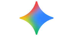
New Gemini icon comes to Android and iPhone
Updates this week to the Gemini app on Android and iPhone introduce a new app icon that adopts the four Google colors. The new four-color logo takes after every other Google icon. It’s still predominantly blue at the right, while the other points are red, yellow, and green. There’s also a nice gradient at center-left like the current ‘G’ icon. The four points are rounded and not as sharp as before for a friendlier look. At small sizes, like on your homescreen, it means the icon doesn’t fade out into very thin lines. Finally, the new logo is slightly larger than the last one and takes up more of the white circular background, which always helps. Ultimately, Google moving to red, yellow, green, and blue brings Gemini into the fold, and can be seen as a sign of confidence. The sparkle shape is unique enough so it shouldn’t be easily confused with other first-party applications. After Android and iPhone, we’re still waiting for the new Gemini icon on gemini.google.com.
9to5google.com
New Gemini icon comes to Android and iPhone
Updates this week to the Gemini app on Android and ...